
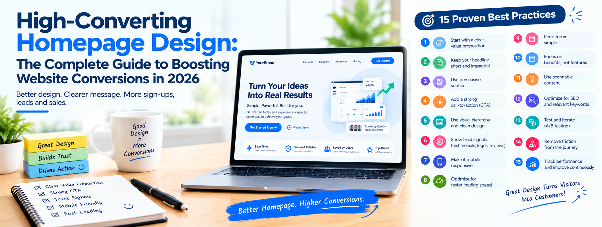
Learn what makes a high-converting homepage design in 2026, key elements, UX principles, and a step-by-step plan to boost your website conversion rate.
Introduction
You have about five seconds before a visitor decides whether to stay on your homepage or hit the back button. At that time, they're not reading your carefully written copy line by line , they're scanning for one thing: does this website understand what I need, and can it give it to me quickly?
Most businesses treat their homepage as a digital brochure. It looks polished, it has a logo, a navigation bar, maybe a slider with three rotating banners, and it still doesn't convert. The problem is rarely the visual polish. It's usually a homepage design that wasn't built around how visitors actually think, scan, and decide.
This guide breaks down what a high-converting homepage design actually looks like, why it matters more than aesthetics alone, and the specific elements, layout principles, and optimization steps that turn passive visitors into leads, sign-ups, and customers. Whether you're redesigning an existing website homepage design or building one from scratch, you'll find a practical framework here, not just theory.
If you'd rather have a specialist team handle the strategy and execution end-to-end, Cronbay Tech's SEO services and design team work together to make sure your homepage isn't just visually appealing but structured to rank and convert.
What Is a High-Converting Homepage Design?
A high-converting homepage design is a homepage built to move visitors toward one clear action, whether that's filling out a contact form, requesting a quote, booking a call, or exploring your services, instead of leaving them to figure things out on their own.
It's not about cramming in every product, service, or achievement your company has. It's the opposite: it's about ruthlessly prioritizing what matters most to the visitor in front of you, removing distractions, and making the next step obvious.
A homepage earns the label "high-converting" when it does three things simultaneously:
- Communicates value instantly — visitors understand what you offer and who it's for within seconds.
- Builds enough trust and clarity to reduce hesitation.
- Makes the desired action unmistakable — one primary button, one clear path forward.
This is the foundation of conversion-focused web design: every element on the page — headline, image, button, testimonial — exists to serve the visitor's decision-making process, not just to fill space.
What Makes a Website Convert?
If you're wondering what makes a website convert, the honest answer is: clarity beats cleverness every time. Visitors don't convert because a website looks impressive, they convert because the website removes friction and answers their questions before they have to ask.
A handful of factors consistently separate converting websites from the rest:
- Message match — the homepage headline mirrors what visitors were expecting when they clicked through (from search, an ad, or a referral).
- Low cognitive load — visitors aren't forced to work hard to understand your offer or find what they need.
- Visible next step — there's always an obvious, single action to take.
- Proof, not promises — testimonials, case studies, numbers, and client logos back up your claims.
- Speed and mobile performance — a slow or broken mobile experience kills conversions before design even gets a chance to matter.
Conversion rate optimization isn't a one-time redesign, it's an ongoing process of testing headlines, CTAs, layouts, and page structure to see what actually gets your specific audience to act.
How Does UX Affect Conversions?
UX design and conversions are directly linked, because every friction point in the user experience is a chance for a visitor to leave. A confusing navigation menu, a hero section that buries the value proposition, or a CTA that's hard to find all quietly chip away at your conversion rate, even if nobody ever files a complaint about it. They just leave.
Good UX design for conversions focuses on three things:
- Predictability — visitors should always know where they are and what to do next, without thinking about it.
- Visual hierarchy — the most important elements (headline, CTA, product visual) should be the most visually prominent, guiding the eye in a natural scanning pattern.
- Reduced friction — every extra click, unclear label, or unnecessary form field is a small tax on your conversion rate.
A homepage with strong UX doesn't necessarily look flashier, it just feels effortless to use. That feeling of ease is what keeps visitors moving toward conversion instead of bouncing.
What Are the Key Elements of a High-Converting Homepage?
Here are the core building blocks that consistently show up on homepages that convert well, regardless of industry.
1. A Value Proposition That Lands Immediately
Your headline should answer, in plain language: who is this for, what problem does it solve, and why should they care right now? Avoid vague, feel-good taglines. A strong formula is:
[What you help with] + [for whom] + [without what friction]
Skip jargon and industry buzzwords. If a first-time visitor has to reread your headline to understand it, it's not working hard enough.
2. Minimal, Purpose-Built Navigation
Your website homepage design shouldn't overwhelm visitors with a dozen menu items. Stick to the essentials, services, about, resources/blog, contact, plus one clear CTA button that stays consistent (in wording) across the entire site. If you're unsure how your competitors structure their menus and offer pages, an SEO company in Bangalore with hands-on website audit experience can help you benchmark this quickly.
3. A Hero Section That Does the Heavy Lifting
The hero, everything visible without scrolling, needs to combine your headline, a supporting subheadline, a relevant visual, and your primary CTA. This is prime real estate; don't waste it on generic stock photography or rotating banners that dilute your message.
4. Visual Hierarchy That Guides the Eye
People scan pages in predictable patterns (commonly F-shaped or Z-shaped). Your most important elements, headline, CTA, hero visual, need the strongest visual weight through size, contrast, and placement. A simple test: squint at your homepage. If your eye doesn't land on your headline and CTA first, your hierarchy needs work.
5. One Primary CTA, One Supporting Secondary CTA
Too many competing buttons create decision paralysis. Use one high-contrast, high-commitment CTA (e.g., "Get a Free Quote") alongside a lower-commitment secondary option (e.g., "See Our Work") for visitors who aren't ready to commit yet.
6. Social Proof With Context
Logos, review counts, and client numbers build credibility, but only when they're specific. "500+ businesses served" is fine; "500+ Bangalore businesses grew organic traffic by 3x" is far more persuasive because it's tied to an outcome your visitor actually cares about.
7. Testimonials Placed Where Decisions Happen
Rather than parking every testimonial in a carousel at the bottom of the page, place a strong, outcome-specific quote right next to your CTA or pricing section. This "proof sandwich", claim, proof, action, reduces hesitation exactly when it matters most.
8. Trust Signals and Credibility Markers
Certifications, years in business, security badges, or recognizable client logos reassure visitors that they're dealing with a legitimate, capable team, especially important for service-based businesses where trust precedes the first conversation.
9. Mobile-First, Fast-Loading Design
With the majority of web traffic coming from mobile devices, your homepage needs to load quickly and function flawlessly on smaller screens. A homepage that looks great on desktop but breaks on mobile is actively costing you conversions every day.
10. A Footer That Still Works for You
Visitors who scroll all the way down have already engaged with your core message, that's high intent, not a dead end. Use the footer for a final CTA, key service links, and easy navigation, instead of treating it as an afterthought stuffed with legal links.
Homepage Design Best Practices
Beyond the individual elements, a few cross-cutting homepage design best practices consistently improve performance:
- Contain your conversion elements. Buttons, forms, and key CTAs stand out more when placed inside a visually distinct container (a card, a colored box, extra whitespace) rather than floating loosely on the page.
- Use contrast intentionally. Your CTA button should be the highest-contrast element on the page, not competing with a dozen other brightly colored elements.
- Give elements room to breathe. Cramped layouts increase cognitive load. Generous whitespace around your CTA and key messages makes them easier to notice and act on.
- Keep messaging consistent across the funnel. If your homepage CTA says "Book a Free Consultation," don't switch to "Contact Sales" on the next page, small inconsistencies quietly erode trust.
- Test before you assume. What works for one industry or audience may not work for another. Treat your homepage as a living asset you continuously refine based on real user behavior, not personal preference.
- Align content structure with topical depth. Search engines increasingly reward pages that fit into a clearly organized site structure. If you're building out your broader site, this complete guide to topical authority in SEO is a useful companion read for making sure your homepage sits within a well-structured content ecosystem.
How to Improve Your Homepage Conversion Rate
If your homepage traffic is healthy but conversions are lagging, work through this practical sequence:
1. Audit your current homepage against the elements above. Identify where the value proposition is unclear, where CTAs are competing with each other, or where trust signals are missing entirely.
2. Fix message matches first. Make sure your homepage headline and hero content match what visitors expect based on how they arrived, search intent, ad copy, or referral source. Mismatched expectations are one of the fastest ways to lose a visitor in the first few seconds.
3. Simplify before you add anything new. Remove competing CTAs, redundant sections, and generic stock imagery before adding new features. A cluttered homepage rarely improves by adding more, it improves by cutting what doesn't serve the visitor's decision.
4. Strengthen your proof elements. Add specific, outcome-based testimonials and case studies near your CTAs rather than burying them at the bottom of the page.
5. Optimize page speed and mobile experience. Even the best-designed homepage will underperform if it loads slowly or breaks on mobile. Technical performance is table stakes for conversion.
6. Build supporting pages that reinforce your homepage's promise. Your homepage doesn't work in isolation, it needs to fit into a broader website conversion optimization strategy. If your homepage promises expertise, your landing pages need to deliver on that promise. This guide on how to create high-converting landing pages walks through applying the same conversion principles to campaign-specific pages.
7. Strengthen the content and authority feeding into your homepage. A homepage rarely converts in isolation from the rest of your digital presence. Strong content marketing that builds trust before visitors even land on your homepage, combined with solid technical foundations (for businesses running custom builds, see our PHP development services), makes the conversion job on your homepage significantly easier.
8. Keep your SEO checklist current. Design and SEO aren't separate conversations anymore, search engines and AI-driven search results increasingly reward homepages that are technically sound, well-structured, and genuinely useful. This AI SEO checklist for 2026 is a good reference point for keeping your homepage aligned with both user experience and search visibility.
9. Don't neglect off-page signals. A high-converting homepage still needs qualified traffic to convert in the first place. Strengthening your backlink profile through ethical off-page SEO techniques helps ensure the visitors landing on your optimized homepage are the right ones.
10. Benchmark against real competitors, not assumptions. It's easy to guess at what "good" looks like in your industry. Instead, study how established players structure their homepages, price their offers, and position their CTAs. If you're in a competitive local market, this roundup of top SEO companies in Bangalore for 2026 is a useful example of how a well-structured comparison and positioning page builds trust, the same logic applies directly to homepage messaging and layout.
Common Homepage Mistakes That Quietly Kill Conversions
Even well-intentioned redesigns can undo good work by falling into a few recurring traps:
- Trying to say everything at once. When a homepage tries to speak to every possible audience segment in the hero section, it ends up speaking clearly to no one. Prioritize your primary audience and let secondary pages handle the rest.
- Burying the CTA below multiple scrolls. If visitors have to hunt for the next step, most simply won't. Your primary CTA should appear in the hero and repeat at natural breakpoints throughout the page.
- Using decorative animation over functional clarity. Motion and micro-interactions can enhance a homepage, but when they distract from the message or slow down load time, they work against conversion rather than for it.
- Ignoring page speed until it's a problem. A visually perfect homepage that takes six seconds to load will lose a large share of visitors before they ever see your value proposition.
- Treating the homepage as a "set it and forget it" asset. Visitor expectations, competitor positioning, and search behavior all shift over time. A homepage that converted well two years ago may be quietly underperforming today simply because it hasn't been revisited.
Avoiding these mistakes is often less about adding something new and more about being disciplined enough to remove what isn't earning its place on the page.
Weak Homepage vs. Strong Homepage: A Quick Comparison
| Element | Weak Homepage | Strong Homepage |
|---|---|---|
| Value Proposition | Vague tagline or company name as headline | Clear outcome + audience in the headline |
| Navigation | Long menu with too many options | 4–6 essential links, one consistent CTA |
| Hero Section | Generic stock photo, no clear action | Relevant visual, clear headline, one CTA |
| CTA Strategy | Multiple competing buttons | One primary CTA, one supporting secondary |
| Social Proof | Logos with no context | Logos and testimonials tied to real outcomes |
| Mobile Experience | Slow, cramped, hard to tap | Fast, clean, thumb-friendly layout |
| Footer | Legal links only | Final CTA, key links, easy navigation |
Conclusion
A high-converting homepage isn't the result of one clever design trick, it's the product of clear messaging, disciplined visual hierarchy, real proof, and a relentless focus on making the next step obvious for your visitor. Get those fundamentals right, and your homepage stops being a static digital brochure and starts working as your hardest-working salesperson, available 24/7.
If you're evaluating whether your current homepage is pulling its weight, or you're planning a redesign and want it built around conversion from day one, Cronbay Tech's team in Bangalore combines web design, technical SEO, and content strategy under one roof. Learn more about how we approach this on our SEO company in Bangalore page, and see how our full-funnel approach connects homepage design to real search visibility and lead generation.
FAQs
1. What is a high-converting homepage?
A high-converting homepage is a website's front page designed to guide visitors toward one clear action, such as filling out a form, booking a call, or requesting a quote, using clear messaging, strong visual hierarchy, and minimal distraction.
2. What makes a website convert?
Clarity, trust, and low friction. Websites convert when visitors instantly understand the offer, see credible proof it works, and can take the next step without confusion or unnecessary steps.
3. How does UX affect conversions?
UX directly shapes conversions because every point of confusion or friction, unclear navigation, slow load times, buried CTAs, gives visitors a reason to leave. Strong UX makes the path to conversion feel effortless.
4. What are the key elements of a high-converting homepage?
The core elements include a clear value proposition, minimal navigation, a strong hero section, visual hierarchy, one primary CTA with a supporting secondary, social proof, testimonials, trust signals, mobile optimization, and a footer designed to convert rather than just close the page.
5. How can I improve my homepage conversion rate?
Start by auditing your homepage against proven conversion elements, fix message mismatch, simplify competing CTAs, strengthen your proof points, optimize for mobile and speed, and make sure supporting pages (landing pages, blog content) reinforce the promise your homepage makes.
6. Is homepage design different from landing page design?
Yes. A homepage typically serves multiple visitor intents and needs broader navigation, while a landing page is built around one specific campaign or offer with a single, tightly focused conversion goal. Both should follow similar conversion-focused design principles, just applied at different levels of specificity.

.png)